Android VPAT journey
Background
A Voluntary Product Accessibility Template (VPAT) is a document that outlines how well a product aligns with accessibility (a11y) standards. Its primary purpose is to inform customers about a product’s a11y features, enabling them to make informed decisions before purchasing software.
At Slack, we conducted a VPAT by a third party a11y vendor in 2024 following our significant UI change (IA4). During this VPAT process, we identified a total of 542 a11y issues, with Android having 135, iOS having 163, and desktop having 244 issues. Of the 135 issues identified in Android, we immediately assigned the obvious shovel-ready issues, such as those with color contrast and missing image labels, to the responsible teams for resolution.
To address remaining Android issues, we conducted a comprehensive triage process. In this document, we take a look at the major recurring themes of Android accessibility issues and share resolution strategies and lessons learned in the hopes of preventing similar mistakes in the future.
Identified themes
[Note:  for resolved and
  for not-resolved.]
- P1: Error messages are inaccessible
- P2: Headings are not identified
- P2: Missing a11y label on EditField
- P2: Incorrect number of items in list
- P2: Drag and drop in the workspace switcher is inaccessible
- P2: Strikethrough information not conveyed to screen reader users
- P3: Errors indicated by color alone
- P3: Keyboard Navigation and Focus
- Keyboard navigability can help customers with motor and visual impairments use Slack on Android. It’s more commonly used on larger form factors (e.g. tablets). Despite receiving numerous VPAT tickets (45) related to the keyboard navigation, Slack Android currently does not support the large form factor. As a result, we have decided to temporarily deprioritize these issues.
Issue resolution
P1: Error messages are inaccessible.
Report
If the user enters an invalid input to an edit field and presses “Next” (or Submit), an error message is displayed, but the error is not communicated to users using screen readers. TalkBack should announce that it is in an error state when it receives focus, along with the error message so that users understand why it’s in error.
Resolution
On Android, errors can be displayed to users in two primary ways:
|
(1) Immediately below the editing field.
|
(2) Via the SK error banner.
|
In both cases, TalkBack did not announce errors, so users must swipe through the screen to determine what occurred. For case (1), we modified OutlinedTextField so that the error is announced immediately below the editing field. For case (2), SKBanner for the error type was updated so that when an error occurs, the error is announced to screen reader users. The videos below illustrate the changes before and after using TalkBack for case (2).
|
Before
|
After |
P1: Heading is not identified.
Report
The heading lacks clear semantic information, making it difficult for screen reader users to quickly grasp the page’s structure and navigate efficiently. Defining headings enables assistive technology to convey the hierarchical organization of the content, enhancing accessibility and providing an alternative navigation method.
Resolution
We identified and fixed issues with missing headings inside lists (such as in the Preferences page).
The vendor also suggested that titles in the top app bar should also be a heading, but we found that this pattern is not consistent with Android standards after testing other apps. Therefore, we closed those tickets.
P2: Missing a11y label on EditField
Report
Some edit fields do not have permanent labels. It is labeled using placeholder text that is removed when the user enters text. Some users with cognitive difficulties will forget the purpose of the edit field without a permanently visible label.
Resolution
During our recent bug fixes, we encountered a few tricky cases that required collaboration with our design team and screen reader users. Specifically, we focused on our main search field and message input area (AMI). For AMI, space constraints prevented us from implementing an optimal solution. However, for the search field, we opted for a simple yet impactful change by adding an explicit search icon. This minor modification helps users easily identify the purpose of the edit field, significantly enhancing their overall experience.
|
Before
|
After
|

P2: Incorrect number of items in list
Report
When TalkBack users have Always speak number of list items setting enabled and navigate through a list, TalkBack announces an incorrect number of items.
Resolution
Our vintage Slack Kit (SK) Bottom sheet was the primary source of the issue. SK divider, although purely decorative, was considered an item within a list. For example, if the bottom sheet had 7 row items, including 2 divider items, TalkBack would announce “7 items in a list” instead of the intended “5 items in a list”.
To resolve this, we introduced a new SKListAccessibilityDelegate for SKListAdapter, overwriting the a11y CollectionInfo with the correct number of items.
P2: Drag and drop in the workspace switcher is inaccessible.
Report
Workspaces in the workspace switcher can be rearranged, but it requires the user to select a workspace and drag it to the new location. People who lack the dexterity required to perform this action may have difficulties completing the task, or may not be able to complete the task at all.
Resolution
In discussions with the design team, we decided to implement an Edit mode in the workspace switcher. When a user enters Edit mode, a six-dot drag handle is displayed for each workspace row so users know that each workspace row has a drag-and-drop capability.
Additionally, we introduced custom actions (Move before and after) for TalkBack users so users can move each row item from the TalkBack context menu by three-finger tap on a row item or “L” or “r” drawing gestures.
|
Before
|
After
|

TalkBack custom actions to move a workspace up and down by one position.
P2: Strikethrough information not conveyed to screen reader users
Report
Users have the option to format text as strikethrough, but the strikethrough information is not conveyed to screen reader users. It is visually evident that the text has strikethrough, but it is read as normal text for screen reader users.
Resolution
During our conversation, we made a decision based on feedback from a blind colleague and agreed not to fix the strikethrough format. Most screen readers don’t interpret this format, making it verbose and potentially confusing for screen reader users. They may interpret this announcement as part of the message itself.
As a general best practice, it’s recommended to avoid strikethrough format for accessibility reasons. Additionally, some sighted users may find it challenging to read.
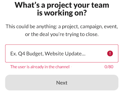
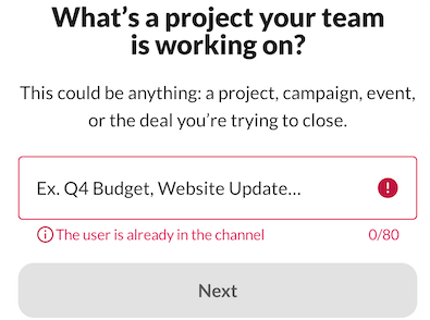
P3: Errors indicated by color alone
Report
If the user enters an invalid input to an edit field, an error message is displayed below the edit field. The only indication it is an error is that it is written with red text. To users unable to perceive red text, the error text is just another message on the screen and not necessarily an error.
Resolution
We recently updated the design for displaying errors in edit fields, but there seems to be some inconsistency in its implementation. To address this, we conducted an audit of our usage and updated several screens accordingly. While it’s a relatively minor change, it improves the intuitiveness of understanding error messages.
|
Before
|
After
|
Conclusion
Through the process of triaging and addressing VPAT issues, we have gained valuable insights.
- One crucial lesson learned is the importance of immediately announcing errors to screen reader users. This eliminates the need for them to navigate through screens to understand the outcome of their actions.
- We discovered that seemingly minor UI changes, such as adding visual icons to text, can have a significant impact on our users’ experience.
- Furthermore, we recognized the need to be more diligent in adding TalkBack custom actions for gestures that may not be easily discoverable, like drag-and-drop or swipe-to-dismiss.
- Collaborating with our a11y-minded design team greatly facilitated the decision-making process and issue resolution.
- Although not all Web Content Accessibility Guidelines (WCAG) standards can be directly applied to Android, the industry has long endeavored to establish platform-specific guidelines for mobile native apps. However, significant progress has yet to be made. Our VPAT analysis revealed that certain accessibility issues are not applicable to Android’s native patterns. To gain a deeper understanding, we dedicated time to testing native Google apps and discussing our decisions regarding the applicability of WCAG standards to Android.
- Our incident revealed that a substantial portion of Android users, approximately 24,000, might be dependent on Android a11y services.
While the timing of our next VPAT assessment is yet to be determined, we are committed to avoiding the repetition of accessibility mistakes in the future. Hopefully, readers have gained valuable insights from this article.
References: WCAG mapping
| WCAG standard | Issue | Description |
| 4.1.2 Name, Role, Value (Level A) |  Error messages are inaccessible. Error messages are inaccessible. |
If the user enters an invalid input to an edit field and presses “Next” (or Submit), an error message is displayed, but the error is not communicated to users using screen readers. TalkBack should announce that it is in an error state when it receives focus, along with the error message so that users understand why it’s in error. |
| 1.3.1 Info and Relationships (Level A) | Heading is not identified. |
The heading lacks clear semantic information, making it difficult for screen reader users to quickly grasp the page’s structure and navigate efficiently. Defining headings enables assistive technology to convey the hierarchical organization of the content, enhancing accessibility and providing an alternative navigation method. |
| 4.1.2 Name, Role, Value (Level A) |  Missing a11y label on EditField Missing a11y label on EditField |
Some edit fields do not have permanent labels. It is labeled using placeholder text that is removed when the user enters text. Some users with cognitive difficulties will forget the purpose of the edit field without a permanently visible label. |
| 4.1.2 Name, Role, Value (Level A) | Incorrect number of items in list |
When TalkBack users have Always speak number of list items setting enabled and navigate through a list, TalkBack announces an incorrect number of items. |
| 2.5.7 Dragging Movements (Level AA) | Drag and drop in the workspace switcher is inaccessible. |
Workspaces in the workspace switcher can be rearranged, but it requires the user to select a workspace and drag it to the new location. People who lack the dexterity required to perform this action may have difficulties completing the task, or may not be able to complete the task at all. |
| 1.3.1 Info and Relationships (Level A) | Strikethrough information not conveyed to screen reader users |
Users have the option to format text as strikethrough, but the strikethrough information is not conveyed to screen reader users. It is visually evident that the text has strikethrough, but it is read as normal text for screen reader users. |
| 1.4.1 Use of Color (Level A) |  Errors indicated by color alone Errors indicated by color alone |
If the user enters an invalid input to an edit field, an error message is displayed below the edit field. The only indication it is an error is that it is written with red text. To users unable to perceive red text, the error text is just another message on the screen and not necessarily an error. |
| [Not planned] Keyboard navigation and focus |
The post Android VPAT journey appeared first on Engineering at Slack.